Tips and Tools for Visualizing Qualitative Data
Anyone with an interest in data visualization who searches out insights and best practices, whether online or in their networks, will certainly discover two trends: one, most discussions are about quantitative data, and, two, the focus tends to be on presenting data.
Although there has been more dialogue recently about data visualization used for exploratory purposes, the field has yet to bring qualitative data visualization to the fore. This is unfortunate because there is so much qualitative data we need to understand better, and because qualitative data helps us understand certain things much better than quantitative data does.
Whereas quantitative data is about what, when, where, and how much, qualitative data is about:
Who - data may include quotes or personal statements
How - data is about processes and/or change over time
Why - data seeks to identify themes and/or parts of a whole
In this article I will cover a lot of ground based on my experience working on many qualitative data visualization projects over the years.
Purpose of visuals that help us analyze and explore
There are many benefits of using visuals, particularly when it comes to aiding in the understanding of complex information and ideas. The one that is most overlooked, underrated, and misunderstood is the benefit that the creator of such visuals receives, one that must precede any other benefit that a visual might bestow on another.
It might seem obvious that in order to clearly communicate something, one must first clearly understand it. Still, when it comes to creating visuals, most people almost instinctively think about a product for presenting.
At least at first, it is much more useful to think about visuals as tools for thinking. I think of data visuals that are exploratory in nature (as opposed to explanatory) as being less about communicating data to others and more about communicating with the data itself. Again, this is a vital step that must precede any effort to share any knowledge with anyone else.
Best types of visuals for exploring
Most people who work with qualitative data will use some go-to tools for exploring it, though they may not recognize the extent to which they are visual:
Flip charts or whiteboards for notes taken during meetings
Software like NVivo used for analyzing large qualitative data sets
Presentation slides or other visuals used when sharing information among a team
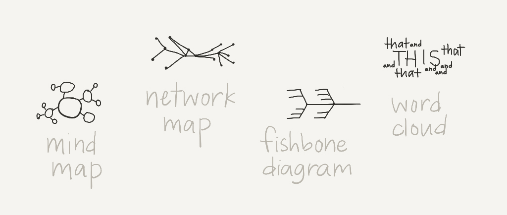
Use of these tools can be taken a step further with the intentional use of some visual diagrams, ones that might be less familiar than the well-known quantitative pie, line, or bar chart/graph.
Mind map
Network map
Word cloud
Fishbone diagram
Want to go deeper with your analysis? Consider using visual symbology as you create these or other diagrams to better understand patterns:
Colors or shapes are best for indicating different categories
Proximity is best for showing closeness of relationships (if items are closer together we will automatically associate them with one another)
Weight or width is best for indicating level of importance, for example of ties or connections
Size can also be used for emphasizing importance or extent, but since studies have shown that people aren’t good at comparing area, differences need to be dramatic
How exploratory visuals differ from explanatory visuals
As important as exploratory visuals are for increasing your own clarity and understanding, most of the time they will not be the same visual you use to help others increase theirs. The visual you might use as a tool for your thinking will naturally reflect your own particular way of thinking. Consider how often you have seen a visual used in a presentation slide that you felt was out of place, that didn’t have enough context for you to understand it and therefore left you just more confused.
Whereas I consider exploratory visuals to be about communicating with the data, explanatory visuals are about communicating with others about the data. To be effective, explanatory visuals must reflect the knowledge and thinking not of the creator but of the viewer. Creating these doesn’t come naturally, but it is still well worth the time and effort required.
Explanatory visuals have the potential to help us:
Capture attention - This should not be underestimated; these days attention is in shorter and shorter supply.
Increase speed of understanding - Let’s face it, many people simply won’t take the time to read a long report.
Maximize retention - We remember visuals more easily than just text.
Stimulate sharing - We also share them more frequently.
Spur action - Visuals are more emotive; we make decisions based on emotions, using reason to justify our decisions afterwards.
Best types of visuals for explaining
Whether you intend to share your data in a report, presentation, or other format, consider first the pros and cons of the type of visual medium you might use:
Photos - Pros: Fairly easy to find and very evocative. Cons: Less flexible; it can be hard to find something precise.
Graphics - Pros: Super flexible and able to be highly technical. Cons: Time consuming to create and generally are less emotive/approachable.
Drawings - Pros: Can be very specific and appear very inviting. Cons: Steep learning curve at first and can connote less seriousness.
Once you select the medium(s), you will also have to make choices about what to represent visually:
Objects are great for triggering specific memories, for example of foods or household items
People, especially their faces, are powerful tools for stirring connection and empathy
Landscapes are good for accompanying big ideas and key experiences
Basic symbols or icons usually add little meaning but they are good for directing focus to text nearby
If you would like to use a diagram, these are the ones most people are familiar with seeing and therefore are best for explanatory purposes:
Circle map
Venn diagram
Quadrant or 2x2 matrix
Flow chart
Feedback loop
Basic design dos and don’ts
After you’ve outlined what you plan to show and how you plan to show it, and it comes time to put pen to paper, it can be easy to get overwhelmed by all the choices you’ll need to make that will determine the specific style of your visuals. Here are some simple guidelines to follow to help you make the best choices possible.
Don’t use software defaults. The best way to avoid this is to not start with software. Most design software is not designed to help you work out ideas. Sketch out ideas ahead of time so you know exactly what you plan to create before you even touch a computer.
Do use color and size to help them focus on what’s important. Use clear headings and subheadings for text, ideally that identify the question the visual will answer, and use smaller text for any accompanying annotations or descriptions. Use a limited number of colors; note that blues and greens naturally fade backward while reds and yellows jump out.
Don’t bog the viewer down with clutter. It will be hard to capture your viewer’s attention if there are too many things for their eyes to grab onto. This includes too much text, too much color, or visuals that don’t add meaning. After you are done with your first draft, print it out, then use a pen to cross out any elements that aren’t absolutely necessary. Your second draft will be so much better. In presentations, follow the 10/20/30 rule (ten slides in twenty minutes and no font smaller than thirty points) and the 5/5/5 rule (no more than five words per line of text, five lines of text per slide, or five text-heavy slides in a row).
Do practice, practice, practice! It is the only way to improve your skills. To help you make the critical transition from knowledge of best practices to application which is the root of true understanding, I recommend requesting and responding to feedback from others, particularly those who are similar to your audience.!
Related articles:


