The field of data visualization has yet to bring qualitative data visualization to the fore. This is unfortunate because there is so much qualitative data we need to understand better, and because qualitative data helps us understand certain things much better than quantitative data does. In this article I offer many tools and tips based on my experience working on many qualitative data visualization projects over the years.
Read MoreTo say that when I first saw the 13 characteristics of white supremacy culture it was a major lightbulb moment for me is putting it too lightly. Sure, it made me uncomfortable to look at where white supremacy runs rampant in my life, and it made me even more anxious to think about talking about that more publicly. But, as always, my values won out. I realized all the potential good that might come of sharing about how data storytelling in particular is arrested by these cultural norms and simultaneously is equipped to disrupt them . . .
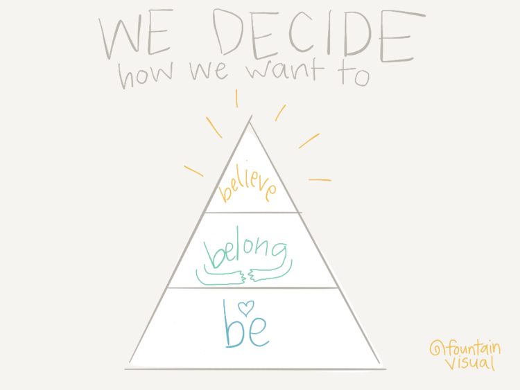
Read MoreLiving in America today most of us are blessed with both the remarkable ability to meet our many needs and the incredible gift of being able to choose how we do so. Yet with a plethora of sources of information, products, and services to choose from, it’s also never been more confusing. How do we choose to get our needs met? Study and experience have taught me that there are three basic motivations we have, three reasons we make the choices we do.
Read MoreI feel so blessed to have received both an appetite for learning and a compulsion to share, and in this spirit of gratitude, I want not only to share this story, my story, with you, but also some useful ideas for how you might practice raising your hand and saying something important. I've broken my tips down in a simple way that speaks to both the scientifically and the creatively inclined.
Read MoreNowadays, we all seem to be swimming in endless data and information. This can present exciting opportunities to understand our work and its impact more deeply. It also means that if we want to help others understand, we need to be able to share data and information in ways that truly cut through the noise. Here are some dos and don'ts to keep in mind as you create game-changing data stories.
Read MoreThis month I feel called to share something I never have before: a curated list of some of my favorite podcasts. I find podcasts to be both the most convenient and the most fun way to explore a diversity of perspectives on any given topic. Here's some that I go to for regular doses of inspiration and guidance. As my interests are so diverse, you are bound to stumble on some serendipitous conversations and connections.
Read MoreIt is time once again to glance backward, gather data and information, and reflect on the past year. To me, this is not merely an excuse to report-out facts and brag about accomplishments, rather it is an opportunity to share both the ups and downs in order to build rapport with you. Because it's always a mixed bag, right?
Read MoreData visualization professionals often focus on numbers, helping to tell the story of what, when, where, and how much. But more often than not organizations first need to better understand the why and how (this is known as qualitative data). Before there is a need to communicate key insights, there is always a need to communicate first about what insights will matter most to the people involved, and therefore what data to plan, collect, analyze, and present. Graphic recording is a method for using visuals to support communication and understanding during real-time dialogue. Hand-drawn illustrations allow teams to simultaneously collect, analyze, and report qualitative data about people and groups.
Read MoreThis Academic Writing Month, Janet Salmons asked me for my suggestions on sharing research work. Here are my responses to her questions, such as “What approaches do you recommend researchers take for using visualizations and images of various kinds to communicate research findings? Is it different for qualitative or quantitative researchers?”
Read More![Using Visuals to Support Collaborative Work [ebook]](https://images.squarespace-cdn.com/content/v1/553d1cdae4b0e618515f1037/1713227937363-JGA582NKGJ4ZAL33XPWG/small+cover+using+visuals+ebook.png)


