3 fun visuals for showing people - Show and Tell Tuesday part 3
Yay! It's Show and Tell Tuesday again and I am delighted to share more fun visuals for you to know and use. This week's visuals are for showing people. People are so important, especially if your work is mission-driven.
PERT chart
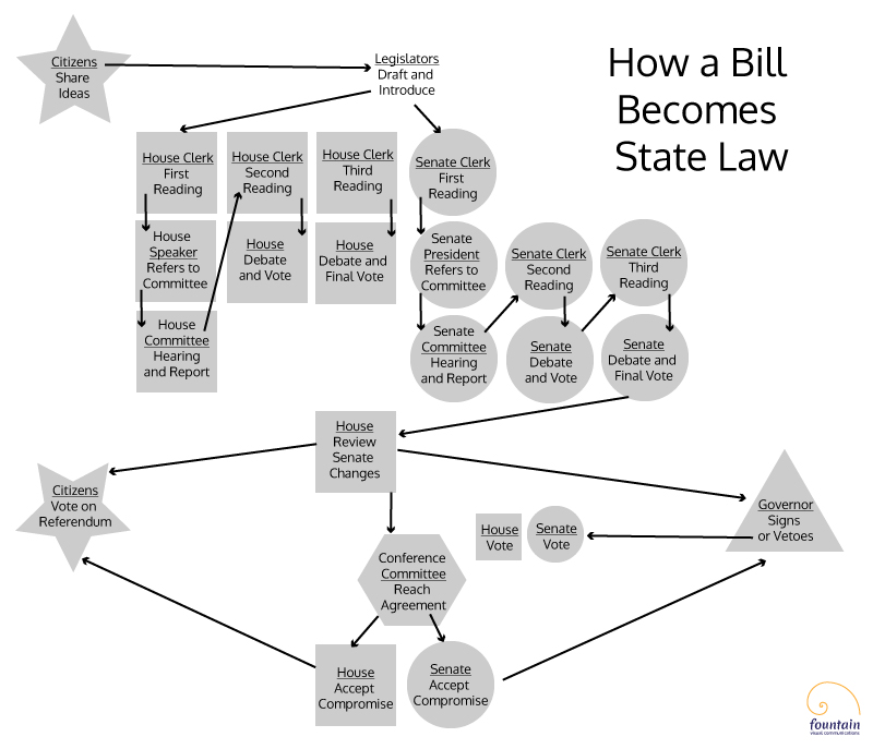
We all know what an organizational chart is, so that seemed too obvious to mention here. Instead I want to show you how you can take a Gantt chart to the next level with a PERT chart.
PERT stands for Program Evaluation and Review Technique and the chart is a flowchart for project management that helps simplify planning for complex projects in which multiple people depend on one another to accomplish various tasks. Creating one is often a collaborative exercise in itself, with different people or teams chiming in about what needs to happen when to support completion.
Just for fun I decided to create an example that describes state legislation as a project (inspiration and information came from a graphic mentioned in this earlier blog). Note that usually start and end dates are noted as well (much harder to do in this instance).
Discussion map
I first heard about this visual in Dan Pink's must-read book To Sell Is Human. He suggests using a discussion map to chart the interpersonal dynamics of meetings in order to better understand the people in it.
Before the meeting, draw a diagram of where each person in the meeting is sitting. When the meeting begins, add an "X" next the name of the person every time they speak. If someone directs their comments to someone else, draw an arrow from speaker to recipient. The resulting visual should reveal who's the most engaged, who's the least engaged, etc.
I've created an example here based upon a panel discussion on government and corruption held in Charlottesville in March and viewable online via C-SPAN (dialogue with the audience begins at 39:00). If you want to see a video showing its creation, visit me on Instagram.
Social network map
This is quickly becoming a more popular type of a sociogram, or a graphic representation of social connections. These maps are fun to explore but they can also serve analytical purposes as they help measure the strength of connectivity, for example.
Below is a short video of me creating a hand-drawn one that shows the relationships between tenants/members of Converge Denver, a coworking community for multidisciplinary creatives that I am proud be a part of.
As an aside, one of my favorite creators of these types of maps is Mark Lombardi, an artist who pioneered diagrams about crime and conspiracy networks in the 1990s. Not only did he also draw them by hand, but interestingly he and I also happen to share the same birthday!
If you liked learning about these visuals please comment below and/or share this post with others.
For more in this series, see:

