3 final fun visuals for Show and Tell Tuesday series (part 9)
Welcome to the last blog in my Show and Tell Tuesday series, which so far has featured 24 types of visuals for showing all sorts of information, from systems to people to amounts to time.
The final three mentioned here are an assortment of fun ones I just couldn't end the series without mentioning.
Pictogram or pictograph
A pictogram or pictograph conveys meaning through pictorial representation. It may be the most historic of all the types in this series as Egyptian's used drawings as phonetic letters in their hieroglyphic writing.
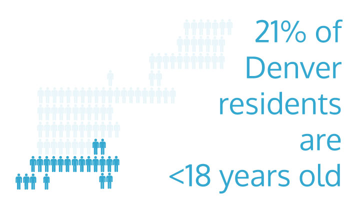
Modern examples often use icons to represent numbers to make them both more interesting and more meaningful. It is important when making them to keep icons the same size and use a key to indicate what they represent.
This example comes from a section of the postcard I created last month about demographics in Denver.
Attunement map
Attunement maps offer a glimpse into social and emotional landscapes, helping you see others' perspectives and thereby increase your ability to influence them. I recommend making the discussion map mentioned earlier in this series first as it will help you take note of the relationships that are important to the person you wish to influence (for example, who influences them, who they look to support from, etc.).
To create an attunement map, you'll note the person's tone or mood and place it on a scale of 1 (resistant) to 10 (open). Do this at the beginning, middle, and end of any conversation or meeting. Then reflect on what might have contributed to changes, if any, including your own mood and actions. Here's an example:
Like the discussion map, I first heard about the attunement map in Daniel Pink's book To Sell Is Human: The Surprising Truth About Moving Others. According to Pink, Amazon.com founder Jeff Bezos takes this exercise a step further and includes an empty chair at meetings to represent the most important but often invisible person: the customer.
Heat map
A heat map shows data contained in a matrix or map by representing values using a color spectrum. They are commonly used to show areas of a webpage (that are clicked on by visitors, for example) or areas on a map.
Here's an example in the form of a geographic map that shows the countries where people live who visited my website this year. (Be sure to sign up to receive next month's postcard if you want to see more fun information and visuals in my 2015 report.)
Note that appropriate use of color is very important for this type of visual as that is how the data is read and understood. While rainbow spectrums are often used in heat maps (mainly because multiple color hues are easier to perceive than shades of gray), it's actually better to use one color with a range of tints or shades (mainly because there is no intuitive meaning to the order of colors in a rainbow).
Here's links to all the blogs preceding this one, in case you've missed any:
Please share them with others! And feel free to leave comments about what you create.


