3 fun visuals about amounts - Show and Tell Tuesday part 6
Finally: some visuals that show numbers!
These fun visuals show amounts within amounts so they are great for comparing numbers within sums of all kinds. They are also a bit more challenging to create.
For these examples I'll be using some global mortality data.
Pareto chart
Let's start with the simplest one.
Pareto charts help reveal the most important categories or factors, usually as related to key problems. It shares its name with the principle known as the 80/20 rule, which states that 80% of the effects stem from 20% of the causes.
Pareto charts contain bars that represent decreasing individual values as well as a line that represents cumulative totals. Sometimes there are two vertical axes (one on the left that shows the range of values and one on the right that shows cumulative percentages of total), but I kept it simple with only one for this example.

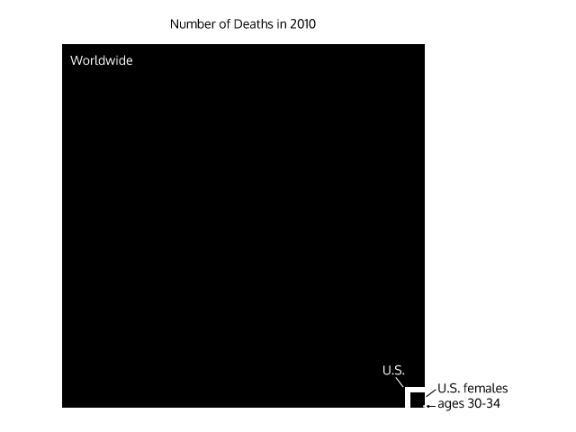
Nested area graph
I first learned about nested area graphs from fellow-data-visualizer Stephanie Evergreen, who credited her inspiration to Innovation Network's report on evaluation in the nonprofit sector.
Basically it's a treemap that shows amounts within amounts. Creating an effective one requires a lot of attention to detail (read: math) as areas must be truly proportional to the data they represent.
In this example my intention is to show just how difficult interpreting area can be for the viewer. I tried to simply show the proportion of people who died in 2010 that were American women my age, but it's hard to tell that U.S. deaths are less than one percent of deaths worldwide and that females are only half of U.S. deaths. Takeaway: proceed with caution when using this graph!
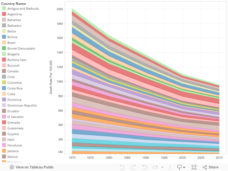
Streamgraph
Streamgraphs are the most complex type of visual shown here, making them also the easiest to mess up.
A streamgraph is essentially a stacked area graph that is displayed in a flowing shape along a central axis, so it's great for showing change over time. It is also usually used to show large datasets.
The example below shows mortality rates in American countries from 1970 to 2010. While it may not appear as organic as some streamgraphs do, I think in general it presents some alarmingly good news!
Please share this blog with anyone else you know who may benefit from understanding numbers better (which is probably everyone). And I'd love to see any that you create in the comments below!
Next time I'll show you more types of bar charts, like the pareto chart above.
Here are links to previous blogs in this series in case you missed them: